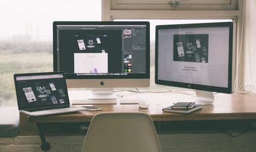
At the beginning of a new decade, perhaps its time to consider updating your website’s design. How many years passed since you updated your site’s design? If it’s been over five or six years, a good starting point is to understand the elements of contemporary website design and what combinations of elements create effective website design. Here are some of the primary elements of web design in 2020. These can help you to create a website that reaches customers and produces conversions.
 We Need a Hero.
An emerging and popular trend in businesses website design is a hero image. What is a hero image? Aa hero image is a sizable picture that fills nearly all of the screen. They are usually found on a website’s homepage. The best hero images use high resolution, saturated, a picture that immediately seizes a customer’s attention. Hero images are primarily used to communicate your brand. The image can show what your company does or convey a message you want to get across. Be careful though, when using a massive image file, be sure you have the server and web host that can handle such a large file. If that is not the case, your hero image will slow your site. Most users won’t wait the extra few seconds it takes for your page to load.
In the Background.
Another idea for updating your site’s design is background videos. It is another attention-grabbing tool that is optimal for building your brand. As with hero images, a background video is usually found on the homepage of a website. It works to get your point across quickly without including voluminous content. It takes an instant to understand what’s in a video as opposed to text. A background video also elicits an emotional response from a visitor to your site. One drawback to a background video is that they tend to be large files and need to have a web host who has sufficient speed.
Menu Please.
Those three lines you see at the top of websites these days are there for a reason. They allow a visitor to quickly navigate a site by clicking on them. The lines are a unit called a “Hamburger Menu” or “Slide Menu”. The navigation links are concealed until they are needed. In several studies, hamburger menus have been shown to increase conversion rates.
 Print It!
Large font (typography) which takes up most of a screen conveying a message is another component to contemporary design. It is a simple and effective way to get your point across quickly. It ensures the user understands your message in no uncertain terms. Large font is another great way to broadcast your message. Using a font connected with your brand can make it recognizable as your brand. Depending on the style of font, it can show professionalism or be fanciful. Using the right font style can convey as much about your brand as the word it spells out. A note of caution when it comes to the font you use; be sure it is supported by the most used web browsers and is viewable on mobile devices.
It’s How it Works.
Over sized product images are an increasingly popular trend in contemporary web design. They show what your product and why it is something a customer has to have. There is no question about what your product does. You can place text next to the item to underscore what its features are and why a customer should choose it over the competition.
If you incorporate some of the elements into your website’s design, you will be ready for e-commerce in the digital age.
We can help you redesign your website or build a new one if you are in need. Contact us for your free consult today info@teachmesocial.net

 We Need a Hero.
 Print It!